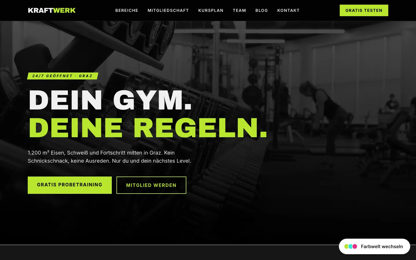
You are running ads for your fitness studio, your ad budget is being spent, the clicks arrive – and almost no one gets in touch. The most common reason is not the ad. It is the destination behind it: the click lands on the homepage, where visitors have to hunt for the one action you want among opening hours, class schedules, and an about-us paragraph. Learning how to create a landing page that converts means flipping that logic: one page, one goal, one clear action.
This guide covers what sets a landing page apart from a normal website page, what a proven landing page structure looks like, and which mistakes quietly cost conversions. By the end you will know how to build a page that turns visitors into inquiries.
What sets a landing page apart from a normal page
A normal website page has to do many jobs at once. A homepage serves several audiences, offers navigation in every direction, and lets visitors decide where to go. That is exactly right for an entry point and an overview.
A landing page works differently. It is built for a single purpose: one goal, one audience, one action. That goal is usually an inquiry – a completed form, a call, a booked first consultation.
The decisive difference is focus. A landing page removes distraction instead of offering options. Often even the main navigation is gone, so visitors do not wander off but take the one action instead. Every section answers only one question: why should I click here, and why now.
That makes a dedicated landing page ideal for campaigns, individual services, or offers. Someone arriving from an ad has a specific expectation. The page that meets that expectation precisely wins the inquiry.
The proven structure of a landing page
There is no secret formula, but there is a tested order. It moves visitors from the first impression to the action, step by step, without detours. The building blocks below make up a solid landing page structure.
A clear headline with a benefit promise
The headline is the most important sentence on the page. In a few seconds it has to say what this is about and what the visitor gets from it. Not a clever pun – a clear benefit promise.
Instead of “Welcome to Studio North”, say what the visitor gets: “A free trial session at your local fitness studio – this week, no obligation.” Concrete beats creative.
Problem and solution
Right below the headline, name the problem that brought the visitor here. People do not look for products, they look for solutions to a specific situation.
Name the situation briefly, then show your path forward. Two or three sentences are enough. A visitor who feels understood keeps reading.
Social proof with real references
Trust does not come from claims, it comes from evidence. Real customer voices, concrete results, and references from your own field carry more weight than any self-description.
The point is real references over bought logos. One credible quote from an actual customer convinces more than a wall of interchangeable brands you have never worked with.
Best of all, place the proof where the doubt arises – a customer quote right next to the CTA, for example. That way the trust signal lands exactly in the moment the visitor is weighing the action.
Concrete benefit instead of a feature list
The most common copy mistake on landing pages is the feature list. Visitors do not care what you have – they care what it means for them.
Translate every feature into a benefit. “5,000 square feet of training space” becomes “room to train without waiting for a machine.” The feature is the proof, the benefit is the argument. Visually, one consistent icon per benefit helps; you can create matching PNGs in your brand color for free with our icon generator.
A single clear call-to-action
A landing page has one goal – so it has one call-to-action. Keep that CTA low-commitment: “Request a trial session” asks less than “Become a member now.”
Repeat the same CTA where it makes sense, but do not offer competing alternatives. Every extra option dilutes the decision.
Trust signals and FAQ
Just before the action, last doubts surface. Trust signals clear them away: “free and no obligation”, “reply within 24 hours”, a clear note on how their data is handled. What applies legally is summed up in our GDPR-compliant website checklist.
A short FAQ block catches the most common objections before they cause a bounce. Three or four real questions are enough – the ones prospects ask anyway.
Common landing page mistakes
Most landing pages do not fail because of one big problem, but because of several small ones. The table below shows the most common mistakes, their effect on conversion, and the better version.
| Mistake | Effect on conversion | Better |
|---|---|---|
| Too many messages on one page | Visitors lose focus and don’t know what to do | One core message, cut everything else |
| Several competing CTAs | Each extra option lowers commitment to the one action | A single, repeated CTA |
| Slow load time | Visitors leave before the page even appears | A lean, fast page with optimized images |
| No mobile focus | Many visitors arrive on a phone and can’t navigate | Mobile-first: tappable buttons, readable type |
| A form that is too long | Every extra field costs completions | Ask only for what you genuinely need |
| Feature list instead of benefit | Visitors don’t see what’s in it for them | Translate features into concrete benefits |
| Bought logos instead of real references | Feels arbitrary and weakens trust rather than building it | Show real customer voices and results |
The thread is always the same: anything that does not serve the one goal works against conversion. On a landing page, removing is often the strongest optimization.
Why speed and a page per campaign matter
Two things get underrated because their effect is invisible: load time, and whether each campaign gets its own page.
Speed decides before the first word. If the page loads too slowly, visitors are gone before your headline even appears. On a phone, where much of the traffic comes from, every delay matters. Google itself names load time as a factor in user experience, as web.dev explains. A fast page is not a technical detail, it is a conversion question.
A dedicated page per campaign serves relevance. Run an ad for “trial yoga class” and link to the general homepage, and you break the promise of the ad. When the destination picks up the exact message and search intent of the ad, expectation and content match. That improves the user experience – and in paid campaigns often the quality score, which in turn shapes your cost per click. The same principle holds for organic search: a focused page per service answers a specific search intent better than a catch-all page.
Put together, this means that if you regularly promote campaigns or new services, you do not need one perfect page. You need the ability to spin up many tailored pages quickly. If your campaigns run in several countries, that applies to every language version; how to set this up cleanly is covered in our guide on creating a multilingual website.
For marketing teams: create landing pages yourself
This is where things stall in practice. The campaign is planned, the ad is ready – but the matching landing page sits in the development or agency queue. By the time it goes live, the best moment has passed.
Marketing teams that can create landing pages themselves have a clear advantage here. They respond to offers, test variants, and adjust copy without filing a ticket for every change. That requires a system built for this pace – not one where every new page is a small project.
JetPages is a custom-built business website with a self-manageable CMS, without WordPress. For landing pages, that means custom design, short load times, and the ability to create new campaign or service pages without a developer. What that looks like in practice is covered on our CMS for marketing teams page. If you first want a sense of possible starting points, you will find concrete templates in our design examples.
How to get started
Creating a landing page that converts is not a matter of talent but of structure and focus. When you plan the next page, work through these points:
- Set one goal and cut everything else
- Write a headline with a clear benefit promise
- Name the problem, show the solution
- Use real references instead of bought logos
- Translate features into concrete benefits
- Choose a single, low-commitment CTA
- Add trust signals and a short FAQ block
- Check load time and mobile display
- Trim the form to the essentials
The biggest lever is at the start: one single, clear goal. Everything else falls in line behind it. When each campaign gets its own fast, focused page, paid and organic traffic finally does what it should – bring inquiries.